ATP Tour
ATP
DESTINATION: TENNIS
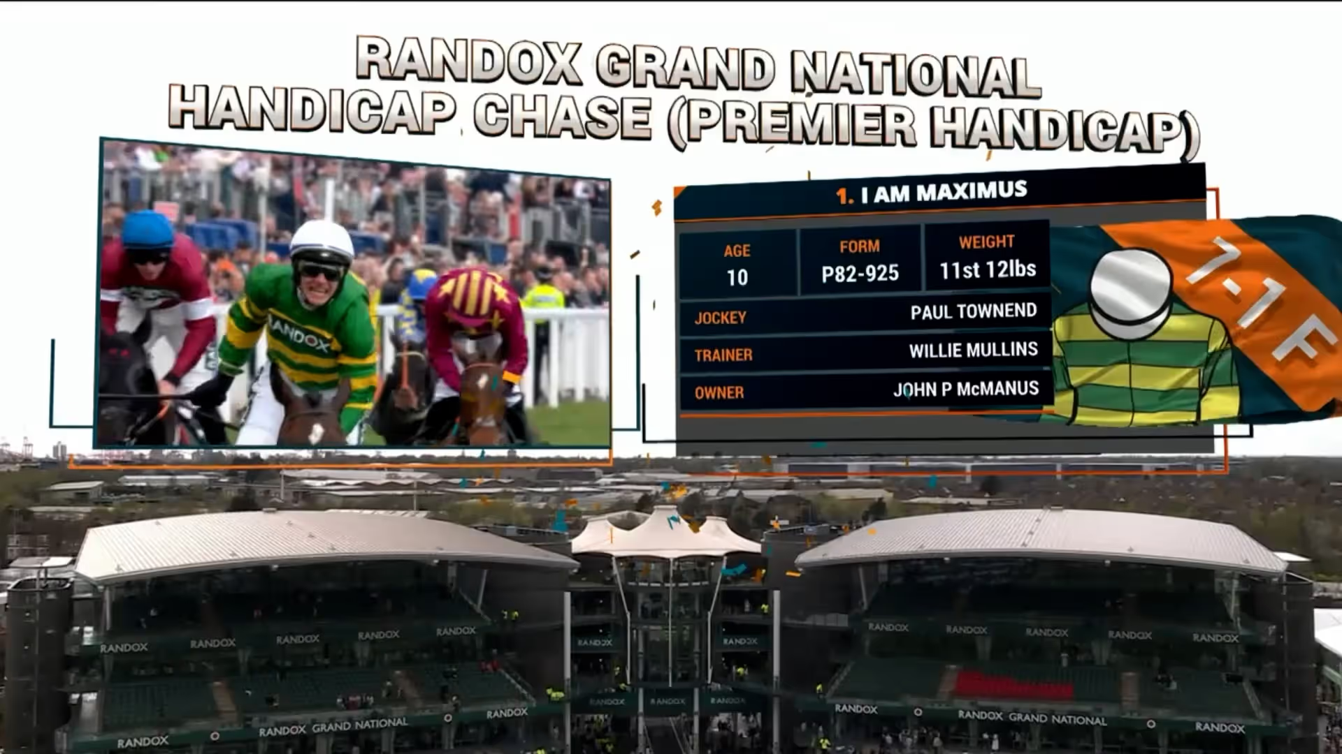
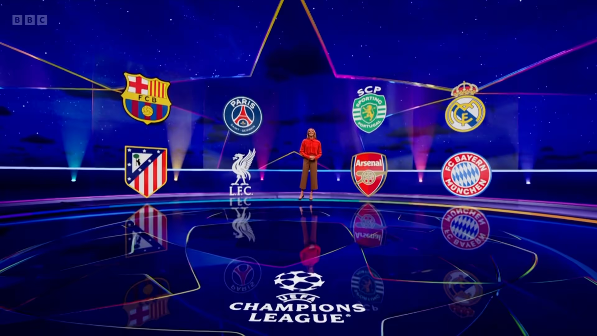
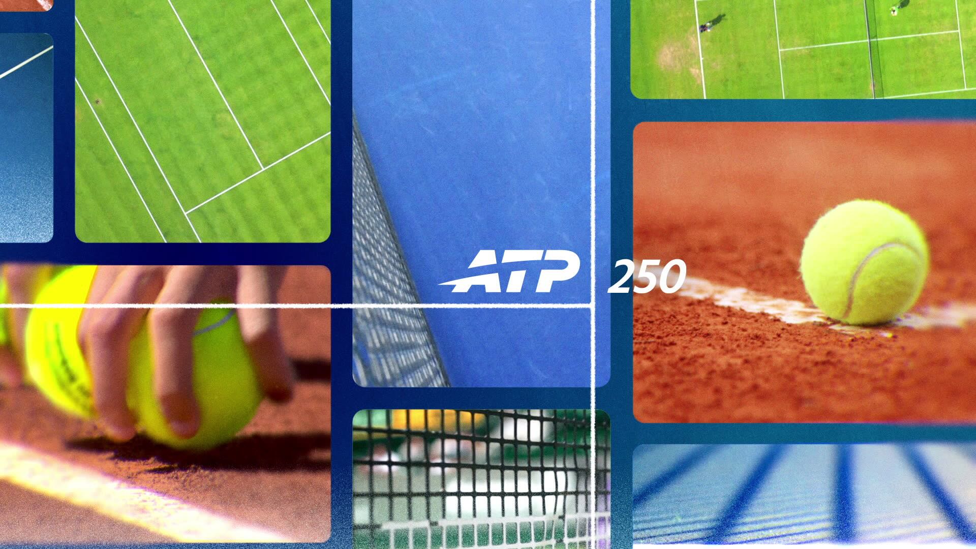
ATP Tour challenged us to build a motion design identity as relentless and colourful as the tour itself. Destination : Tennis became our creative cornerstone, a system designed to follow the athletes across continents, courts, and cultures, from the clay of Roland Garros to the hard blue courts of Miami.


The visual language was built for any screen, design elements deployed across social and broadcast content were deliberately high-energy with bold contour graphics, player footage pushed to the edge of abstraction, and layouts that borrowed from sports editorial and streetwear aesthetics.
The visual language was built for any screen, design elements deployed across social and broadcast content were deliberately high-energy with bold contour graphics, player footage pushed to the edge of abstraction, and layouts that borrowed from sports editorial and streetwear aesthetics.
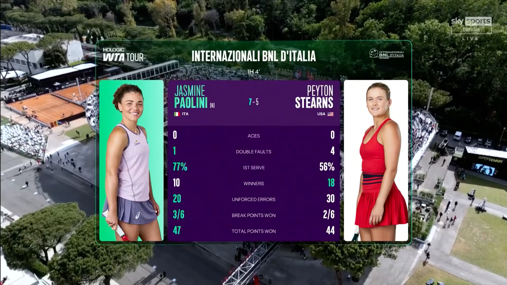
Our purposefully vibrant approach that was impossible to ignore. AE Live wrapped each athlete in bands of brand colour to convey the energy and personality of each tour athlete, this was coupled with their hand-written signature, giving individual identity to a roster of the world's best.
Our purposefully vibrant approach that was impossible to ignore. AE Live wrapped each athlete in bands of brand colour to convey the energy and personality of each tour athlete, this was coupled with their hand-written signature, giving individual identity to a roster of the world's best.
The updateable design system spanned over 55 official ATP tournaments, across 29 from Indian Wells to Shanghai, Montreal to Paris. The titles were designed to introduce the glamour of each host city, whilst introducing a single coherent global motion graphic identity.
The updateable design system spanned over 55 official ATP tournaments, across 29 from Indian Wells to Shanghai, Montreal to Paris. The titles were designed to introduce the glamour of each host city, whilst introducing a single coherent global motion graphic identity.